P
Loading blog...
Loading blog...
A finding that does not communicate is not a finding. It is a data point waiting for someone else to interpret it.
Chloe Dubois
May 11, 2026•4 min read
You have spent three months designing and executing a rigorous study. The data is clean. The analysis is defensible. The findings are genuinely important.
Now you have 30 minutes with the client's senior leadership team to present them. Three of the seven people in the room do not have a research background. One has already checked their phone twice in the first two minutes. Another is asking whether the sample of 380 is statistically significant before you have explained what the question was.
Getting research to influence decisions is a different skill from conducting the research. Here is how to build it.
The most important preparation you can do before a research presentation is to find out what the decision-makers in the room actually need to know. Not what you want to tell them. What they need to know to make the decisions they are being asked to make.
Executive team commissioning market entry research needs to understand: is this market worth entering, what are the primary barriers, and what would need to be true for us to succeed? They do not need to understand the sampling methodology. They need to trust that it was sound. Those are very different things.
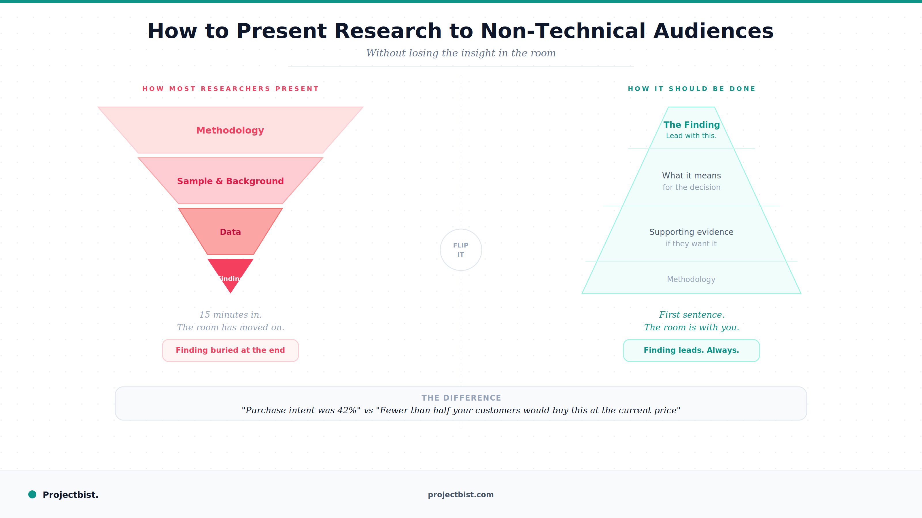
Most research presentations start with methodology. Background. Study objectives. Sample description. Approach to analysis. By the time you reach the findings, 15 minutes have passed and your audience has lost the thread.
Start with the most important finding. Not a headline about the topic. The specific finding that matters most to the decision the client is facing. Here is what we found, and here is what it means for you. Then go back to explain how you got there if the audience wants to know.
This structure, sometimes called the pyramid principle, matches how senior audiences prefer to receive information: conclusion first, supporting evidence after. It is how well-written memos and briefings are structured. Your research presentation should follow the same logic.
A finding phrased as 'purchase intent was 42 percent' communicates data. A finding phrased as 'fewer than half of your target customers would buy this product at the current price point' communicates insight.
Non-technical audiences often struggle with what statistical results mean in practical terms. The translation is your job, not theirs.
Every number in your presentation should be accompanied by what it means for the decision at hand. If you cannot explain why a number matters, reconsider whether it belongs in the main presentation at all.
A chart that contains three trends, two comparison groups, and a confidence interval is not a clear chart. It is a data table with lines. Every visualization in a non-technical presentation should make one clear point, stated explicitly in the chart title. Use chart titles that say what the data shows, not just what the data is about.
Three-dimensional bar and pie charts distort relative proportions and are harder to read than flat alternatives. They also signal to experienced viewers that the presenter may prioritize appearance over accuracy. Simple is almost always better.
Replace 'Quadrant III: Low Importance-Low Performance' with 'Low priority, low investment.' Your audience understands plain language. They may not remember what Quadrant III means three slides later.
The most common difficult question in a research presentation is a methodological challenge from someone who does not fully understand the methodology: 'Is 380 people really enough to represent our whole market?'
The right response is neither dismissive nor evasive. Answer it directly and plainly: Yes. At a 95 percent confidence level with a 5 percent margin of error, 380 correctly sampled respondents produces reliable estimates for a population of any size above roughly 10,000 people. This study comfortably meets that standard.
Then pivot: the more important question for your decisions is what the findings tell us, and that is what I would like to keep us focused on.
Newsletter
Personalize your updates! Subscribe to ProjectBist's Newsletter and choose from the following categories.
Ethnographic Research: How to Study Culture and Community by Being Present in Ways Other Methods Cannot
Survey Translation and Back-Translation: How to Ensure Your Instrument Means the Same Thing in Every Language
How to Build a Research Firm From Scratch: What the First Three Years Actually Require